This article is written by Michelle G. Brown of Mixed Media Art
One of the (many) amazing things about the Craft and Hobby Industry show is the artwork that is on display, whichever way you turn! Every booth is covered with fantastic artwork, showing off both the manufacturers wonderful products and the designers amazing flair, creativity and individual style.
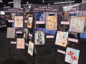
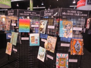
The Ranger booth had the most wonderful gallery on display, showcasing 22 different designers and artists who all answered the question “How do you Distress?” in their own creations. There were canvases, altered boxes and other substrates, using many different Ranger products.
Here are a few of the ones that caught my eye.
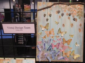
These gorgeous 3D butterflies by the Vintaj Design Team were such a delight with their colours and 3D design. The tree branch, using a real twig, and leaves help to frame the artwork.
~ * ~
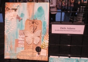
Debi Adams combined the vintage creams with light blue. I love her use of texture paste for the leaves on the left, as well as the burlap tag and vintage music.
~ * ~
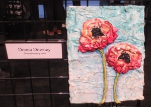
Donna Downey showcased her wonderful 3D poppies with lots of texture and depth – I just wanted to touch this one!
~ * ~
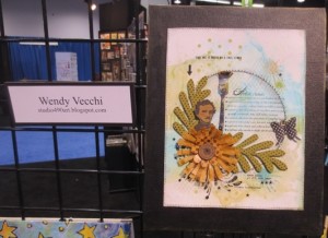
Ink washes creates these lovely layers of green and blue, by Wendy Vecchi. She the added some stamping and cut outs to add a focal point.
~ * ~
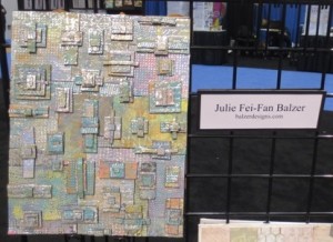
Julie Fei-Fan Balzer presented this fun, metallic rectangle stack up, that is just full of colour and texture. Julie runs us through the steps for this embossed foam and distress paint process in this tutorial on her blog.
~ * ~
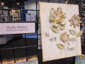
Shelly Hickox created this piece with a subtle background and stunning 3D flowers. I love all of the soft colours on the flower petals and leaves.
~ * ~
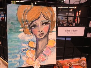
Combining her gorgeous face sketch with 3D elements, Dina Wakely has put these elements over a soft bluey, green background, created with stencils and a paint wash.
~ * ~
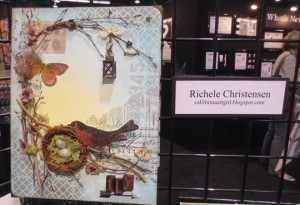
Richele Christensen has created this lovely piece using a range of inks and stamps to frame the central focal point, adding a variety of garden elements to compete the work. I love the bright yellow that draws the eye into the artwork.
~ * ~
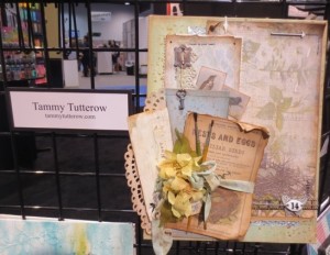
This vintage piece was created by Tammy Tutterow – just look at the edges of the ephemera; lovely and curled and edges with brown, giving it the prefect aged look.
~ * ~
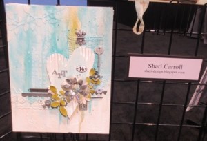
Shari Carroll has used texture paste to create a great background, then adding a simple, yet effective heart and flowers as the focal point.
~ * ~
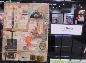
Tim Holtz has used layers of inks and tissue to create this background, adding a selection of Ranger and Idea-ology ephemera to complete the piece.
~ * ~
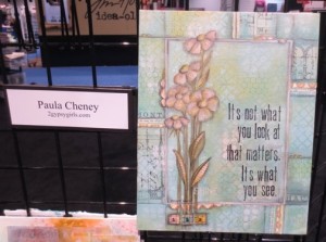
And finally, Paula Cheney has created a lovely frame, using the same elements throughout the piece but adding stamping and highlights in charcoal to set the frame apart from the central focal point.
~ * ~
Each and every one of these pieces will provide inspiration and with such a variety of colours and mixed media techniques used, I’m sure you will find at least one or two that appeals to your colour palette and style.
Happy creating!
~*~*~*~*~*~*~*~*~*~*~*~*~*~*~*~*~*~*~*~*~*~*~*~*~
Michelle G. Brown is passionate about mixed media art and enjoys sharing her knowledge and techniques with you to allow you to express your own creativity. Michelle understands that many of us have an inner need to create. By learning a few basic techniques the amazing world of mixed media art is accessible to everyone!
You can see more of Michelle’s work at Mixed Media Art or via Facebook – Creating Mixed Media Art
~*~*~*~*~*~*~*~*~*~*~*~*~*~*~*~*~*~*~*~*~*~*~*~
.
.



Thanks so much for this peek at such lovely creations.Gosh we can sure learn a lot from these designers.Fancy getting a box of Ranger Products delivered to your door to play with..bliss!!!