~*~
This article is written by Ann Strecko Koeman
I recently had the opportunity to try working with “Creative Medium”, a new line of products by Imagine® Crafts. I can honestly say that it was a pleasure and I really do intend to play (ahem, I mean work) with these products more.
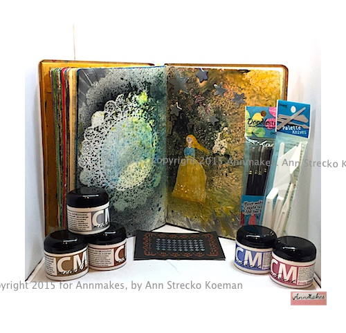
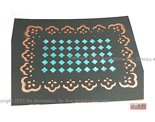
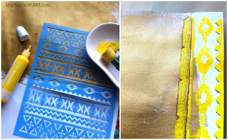
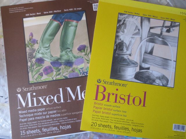
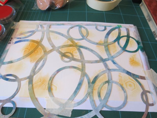
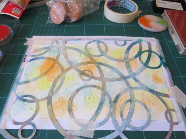
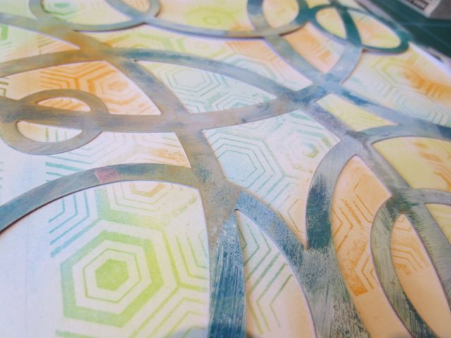
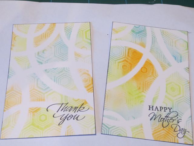
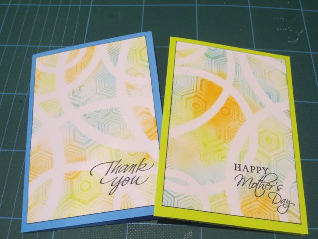
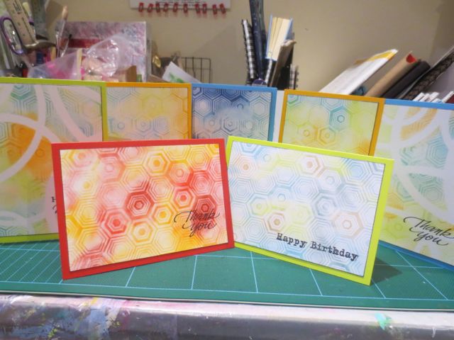
First of all let me briefly explain that these products are “a creamy paste that produces a bold metallic” or “iridescent dimensional effect” on various backgrounds. The “Medium” can be applied with a palette knife and used on a variety of surfaces such as canvas, card stock, acrylic, plastic, ceramic, wood, and glass. Note that a “Surface Compatibility Chart” is available to download from www.imaginecrafts.com.
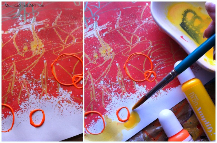
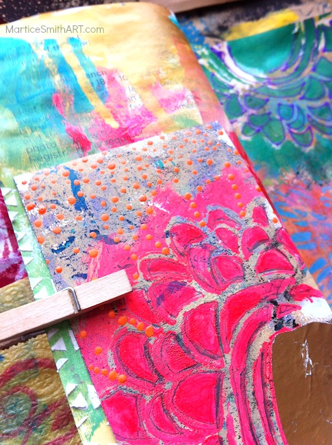
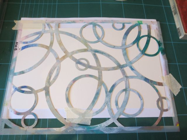
The Medium can be made interesting by using DoodleStix™, palette knives, and other mark making tools. The medium can also be sprinkled with glitter while it is still wet. When dry it can be stamped and coloured with pigment or solvent inks (such as StazOn®, Brilliance®, and Memento Luxe®) . The time for drying is short and does vary depending upon how thick the layers are. I found the product to take between a few minutes for a thin coat and up to half an hour for a very thick coat. It is recommended to let the product air dry to obtain optimal results. I concur that when using thicker layers and trying to use a heat drying tool the outcome is different than letting the product air dry.
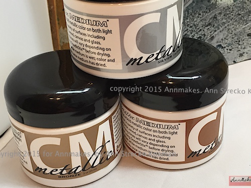
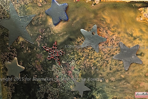
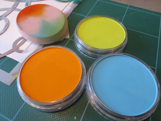
I got to work with the Creative Medium in metallic in the colours; Copper,Silver, Bronze, and Gold. I did try and was pleased with the results of using the product on light and dark surfaces. When I tried the product on a flexible surface such as paper I was pleased to see that it was flexible , and did not crack or flake, when I manipulated the paper. I also found the product to adhere well to all hard surfaces and left a very smooth like finish when dry. I would almost compare it to a leathery feel.
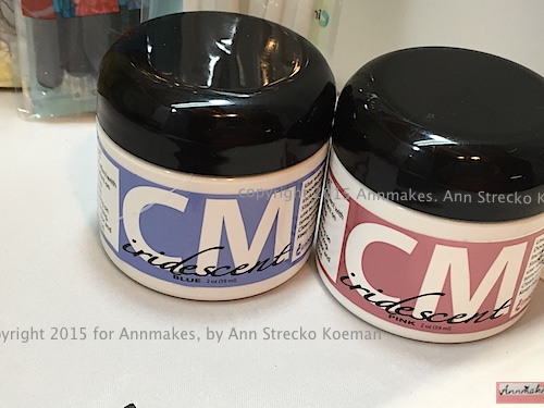
The Iridescent Mediums I got to try were the; Pink, Blue, Purple, Chartreuse, Green, and Turquoise. I enjoyed watching the medium transform itself from a plain looking whitish paste when wet to beautiful shiny colours when dry. The effect is more apparent on darker surfaces. However, using the same product on lighter coloured surfaces gives a “mother of pearl: effect which is very pretty.
Due to my own sensitivities to smells I was pleased that the product produces very very little odour and I found it pleasant to work with. The “Doodlestix”, also from Imagine Crafts are silicone-tipped tools used to create texture, manipulate mediums and enables the artist to add details. I really like these tools and found the tips to be very flexible and easy to clean. The “Palette Knives” are just the right size and clean up easily as well. I was able to clean off both sets of tools with a damp cloth and even a baby wipe.
Note: that it is recommended (and I agree) that when using any tools especially stencils and intricate stamps that you clean them before the product dries on them.
~*~*~*~*~*~*~*~*~*~*~*~*~*~*~*~*~*~*~*~*~*~*~*~*~
Ann Strecko Koeman lives and works in Ontario, Canada with her husband and two sons. She blogs, writes about and makes things every day from her home based studio and office
You can see more of Ann’s work and find links to her other published posts, and videos at annmakes.blogspot.com
~*~*~*~*~*~*~*~*~*~*~*~*~*~*~*~*~*~*~*~*~*~*~*~*~
Disclosure: These products were supplied by Image Crafts for the purpose of review. All opinions are that of the MixedMediaArt team. Some links on this page may be affiliate links and any purchases help to support the ongoing work by MixedMediaArt.
.
.


Recent Comments