~ * ~
This article is written by Marilyn Harris Mills
Here is the second installment in Marilyn’s Good Design and Composition. You can read the first installment here: Good Design and Composition for Mixed Media Art, which covers the elements of a good design. Now let’s look at the principles of design….principles that should apply to each piece of art work we create. This is the “how-to” for achieving good design.
6 Principles for Good Design and Composition
1) Proportion
Consider all the individual design elements in your painting. Are they all proportional or are some too dominant and others to small. Think of a flower. Are the leaves larger than the petals consequently the flower looks abnormal? Perhaps this would work in an abstract painting but if you’re aiming for a still life or a realistic style then the painting would not be proportional. Proportion and scale is all about size relationships. Proportion deals with the size of the parts that make up the whole. Sometimes artists will change proportions of different elements in a painting, but it still has to look right in relation to the entire composition for the painting to work.
2) Unity/Variety
A principle where all the individual components of the painting tie together. This creates a piece of art wherein all the components or elements in the design co-exist with each other and complement each other. Colours, backgrounds, layout, embellishments, brush strokes etc all work together and not one area of the painting is amiss. When a painting has unity, there is a feeling that it all works together as a whole and is complete. Variety is often linked with unity. While you want to have unity, you don’t want it to be boring. Having all shapes the same size would provide unity but it would not have much variety. Change the size or change the shapes. Variety can be achieved with colour, size, texture and edges. When a painting has both unity and variety, it is said to have harmony. Harmony within the painting is to be strived for.
i.e. a Chinese art piece….motifs, colour, symbols that are Chinese in style will not work together if a Canadian maple leaf is added to the art.
Artwork by Gloria Malouf-Marsh – A Desert at Sunset
3) Contrast
Contrast makes your painting exciting I think. You can use lights against darks. A stroke of intense colour can make a neutral painting sing. The meaning of contrast are the differences when you compare one thing to another. Differing values in a painting can be dramatic. Diagonal lines against verticals, colours that jangle, lights against darks, soft edges against hard edges, intense colour against neutral colour…..there are a variety of ways to create contrast in your painting.
4) Rhythm/Repetition
Rhythm is created by having an element repeat itself in the painting. Rhythm always has repetition. Repetitions move your eyes through the painting. Rhythm can be regularly repeated, like lines, shapes, colour etcetera, or repetitions that alternate, for example from large to small, warm to cool et cetera. Repeating shapes can lead the eye through a painting and give it rhythm. Sometimes the rhythm can be lyrical for example just like in music.
5) Balance
Think of a teeter-toter, the balance is in the middle. The design must be balanced for it to work effectively. If the design is balanced then the scale of it is also in balance. So one way of thinking of balance is large elements combined with small elements in the picture will provide a balanced painting. If you have only used large elements then the entire painting is off balance. Balance is key to a successful painting. When something is balanced it looks right. You can use colour to achieve balance. You can use a large shape balanced with several small shapes. I tend to think balance is ingrained in ourselves but others may need to work at maintaining balance.

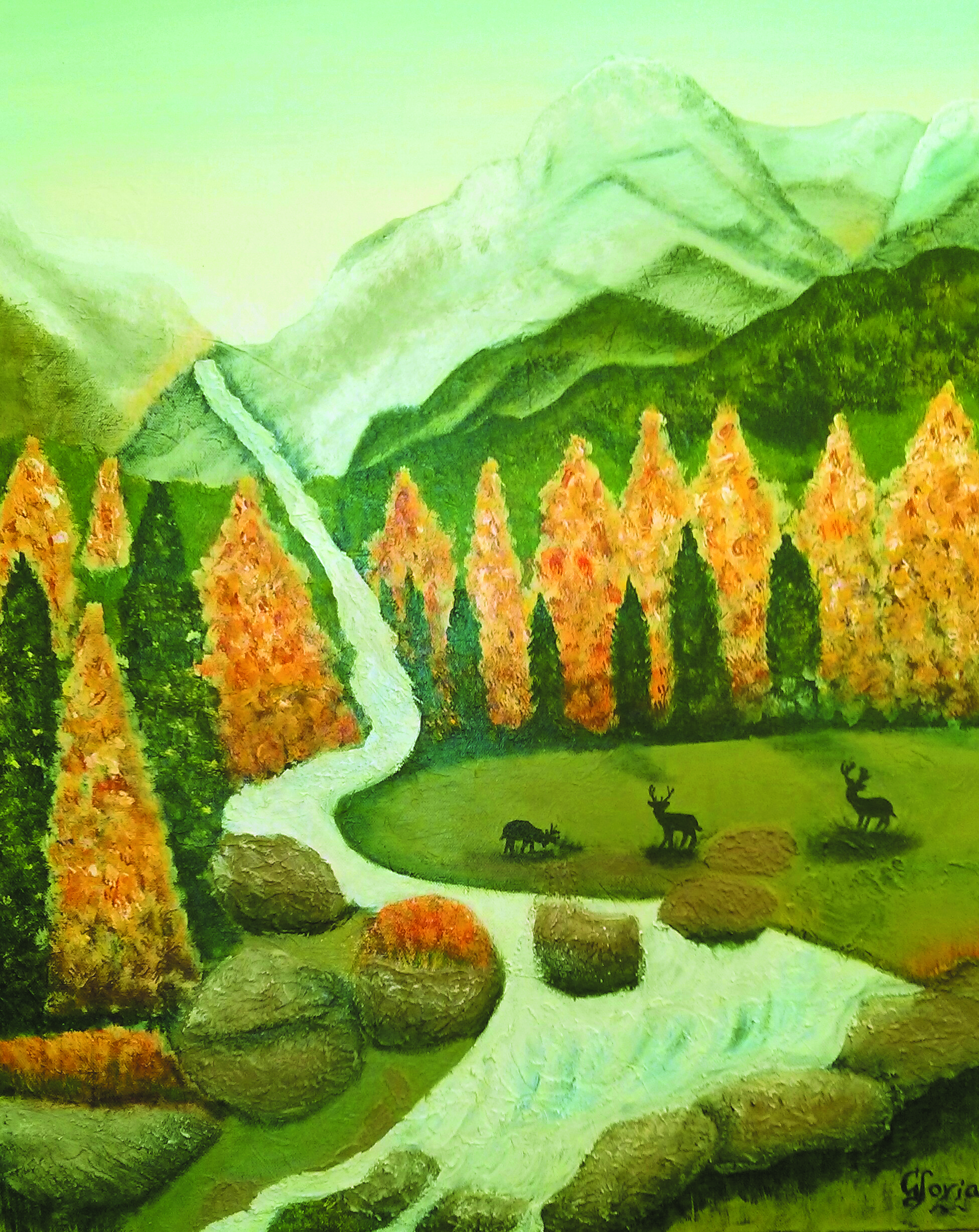
Artwork by Gloria Malouf-Marsh – Late Afternoon at Elk Meadows
6) Focus/Emphasis
Does your art piece establish a focal point or does the viewer travel all over the project trying to find a landing place for the eye to rest. If there is no focal point, then the viewer will get confused, feel disturbed and otherwise will miss the message the artist is trying to elicit. Every painting needs a centre of interest and without one, the painting is rendered without much thought by the artist and deemed unappreciated by the viewer. There are many ways to create a focal point. Lines can point you there. Value contrast (lights and darks), size, and even content are all ways to helping create a focus in the painting. Having a theme or story to your painting gives your painting emphasis. That’s why I like using symbols and imagery in my mixed media art. They tell a story for me.
Stay ARTistically Inspired…
Maer
Read Part One: Good Design & Composition for Mixed Media Art
Read Part Three: Further Composition for Mixed Media Art
~*~*~*~*~*~*~*~*~*~*~*~*~*~*~*~*~*~*~*~*~*~*~*~*~
Marilyn Harris Mills, aka Maer, is a Published Artist, Teacher and Designer, in Ottawa Canada. Her art has been published in “Creating Time: Using Creativity to Reinvent the Clock and Reclaim Your Life”
“I work in whatever medium likes me at the moment”-Mark Chagall
~*~*~*~*~*~*~*~*~*~*~*~*~*~*~*~*~*~*~*~*~*~*~*~*~
.
.


Hello marilyn. …….nice to read your valuable article about composition. It is very important to learners or students who wanna know more about good composition i.e. how to ccreate a well balanced composition.
Thanks for giving such a wonderful knowledge.
God bless you.