~ * ~
This article is written by Katja Blum
Illumination is the art of embellishing individual letters or symbols on a page of written text. The letter, usually the first letter of a page or particularly important passage is decorated with patterns and may contain intricate symbolic drawings or a miniature. The word “illuminate” means “to fill with light”, and the art derived its name from the technique of filling parts of the letter or background with gesso – not the acrylic primer, this stuff involves boiling rabbit carcasses – and covering the raised area with gold leaf.
Illumination has been around since 1500 BCE, when scribes began to illuminate Egyptian Books of the Dead. In the Middle Ages, artists created incredibly beautiful illuminations of sacred texts all over Europe and Asia. Famous examples are the Lindisfarne Gospel and the Book of Kells. As the printing industry progressed, illuminations became too labor-intensive and fell out of style. In the late 19th century, the illumination work of English artist William Morris led to a brief revival of the art form. Today, many calligraphers create commissioned illuminations, often as monograms for special occasions.
As a mixed media artist, focusing on the shape, form and symbolic value of a single letter can bring an extra dimension to your artwork. While it is very rewarding to create within the rules of traditional illumination (maybe minus the rabbit sizing), you can create fascinating effects if the letter is the centerpiece of the work, not just enhancing but completing or even replacing text – either carrying the whole piece or adding a layer of meaning to the work.
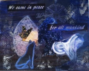
For “We Came In Peace”, I started with free association about the moon. This is the part where the illuminated letter concept gets to be big fun. Do a brainstorm and run with your ideas. You definitely don’t have to be literal; perhaps you have personal associations with the letter or concept that will surprise both you and the beholder.
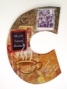
Two- and three-dimensional letter shapes are trending right now, and I’m a fan! Exploring different letter shapes as the basis of your work lets you play with space and contours and takes you far away from the ever-present rectangular boundaries of paper and canvas. “Coffee” is about my love for old-fashioned coffeehouses and pretty much any caffeinated concoction. The color palette in this piece sort of designed itself – and also goes great with our kitchen wallpaper.
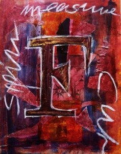
With “Fates”, I moved away from concrete images, concentrating on lines and textures instead. Again, the letter is not the first of any word I used, but refers to the overall idea instead. There is actual illumination, even though I replaced the raised gold leaf with mica powder.
Explore the possibilities of illuminated and embellished letters in mixed media artwork, combined with text, imagery or standing alone. Following your imagination ‘to the letter’, you will discover more creative potential of mankind’s most powerful invention – the alphabet.
~*~*~*~*~*~*~*~*~*~*~*~*~*~*~*~*~*~*~*~*~*~*~*~*~
Katja Blum is a writer and translator from Tulsa, OK. As an artist, she started with yarn, fabric and paper mache (rarely together), branching out into collage and other paper arts about ten years ago. Her latest obsession is making soft stuffies and art dolls – to the delight of her toddler. She also likes to find creative solutions for ugly or broken things around the house – to the delight of her husband.
You can see more of her work with fiber, paper and words at www.thewaywardsheep.com
~*~*~*~*~*~*~*~*~*~*~*~*~*~*~*~*~*~*~*~*~*~*~*~*~
.
.
I have just recently started exploring illuminated letters! They have always fascinated me when I have come across them in books…I really enjoyed reading this, and love your examples that you have shown here. i am planning on concentrating more on this art form in the next few months, both with the gold leaf and the symbolism…I think I would be great in one of my altered books. Thanks for a great article!