~ * ~
This article is written by Michelle G. Brown
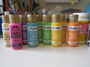
This week I got to play with some FolkArt paints, provided to us by Plaid, to see what I could do with them. I do love playing with paints; they are a relatively cheap materials, come in lots of wonderful colors and gives me the ability to coordinate all of the elements I need to create many types of mixed media art
The colors looks all so nice together (I’m a real sucker for “Rainbow” colors) but I was worried about using so many colors on the one canvas, so I did some testing to find color combinations that I liked; remember that I’m not very brave when it comes to combining colors. These were the trials that I completed:
I actually liked most of them but only had three canvas panels so I narrowed it down to three combinations that used a variety of paint colors.
Top: Lime Green, Deep Ocean Blue and Ivory White
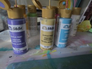
Middle: Deep Ocean Blue, Perfect Purple and Toasted Vanilla
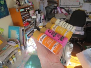
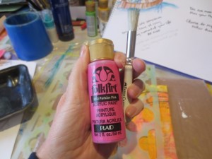
Bottom: Vivid Orange, Parisian Pink, Moon Yellow and Ivory White
With my color combinations selected, I was ready to get started.
Materials and Tools for the Mixed Media Canvases
– selection of acrylic paints: here I used Plaid FolkArt Paints
– 3 5”x7” canvas board panels
– collected ephemera; 5 different fonts
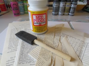
– Matte Mod Podge and sponge applicator
– Gesso and applicator
– Gelli Plate 8”x12”
– Brayer
– Deli paper, ephemera and copy paper in A4
– Stencils: here I used Stencil Girl L174 Ward Quatrefoil Mix
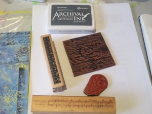
– Variety of rubber stamps and grey archival ink
– Watercolor pencils: black and white
– charcoal pencil and blender
– Markers and pens: I used Sharpie White, white gel pen, black Sakura Pigmento Micro 02 and Montana Extra fine Acrylic Marker filled with black Golden High Flow Acrylic in Carbon Black
Creating the Background Layers
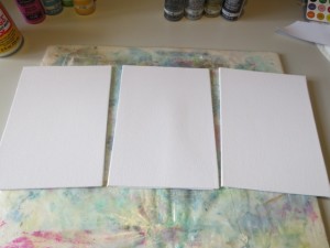
1. Lay out the canvas panels
2. Collect a range of ephemera and tear into pieces. I like to use four to five different texts and fonts to make sure there is enough variety in the background. Get these ready before you start to get sticky.
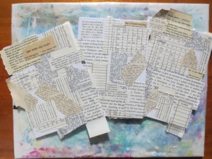
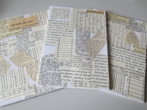
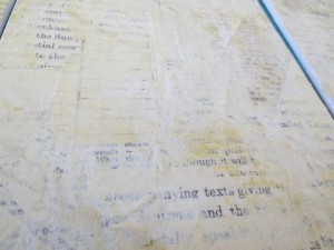
3. Adhere to the canvas panels, leaving some pale edges overlaying the edges
4. Cut off the excess ephemera with a craft knife and use a sanding block to smooth the edges of the canvas
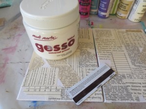
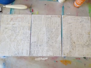
5. Get out your Gesso and an old store card or spatula and roughly apply a layer of Gesso over the dried ephemera layer. Leave to dry.
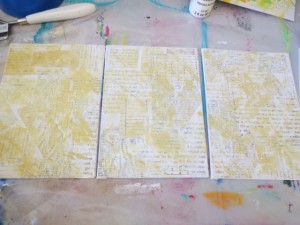
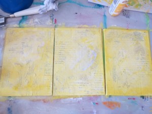
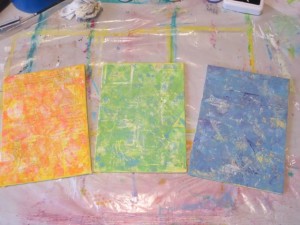
6. Add a layer of bone coloured acrylic paint, then a little ivory white and then a layer of yellow as a wash
Leave canvases to dry.
Creating Color Coordinated Papers with Gelli Plates
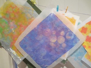
While the canvas panels are drying, get set up to create some color coordinated papers to add to the canvas panels. This is the advantage of using paints where we can make all of our bits and pieces match. Here I’ve used a Gelli Arts Gelli plate, with the paints and stencils and a variety of ephemera.
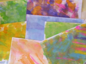
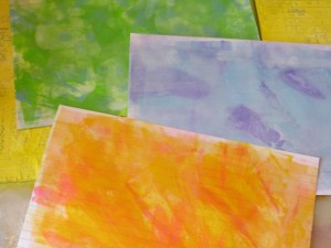
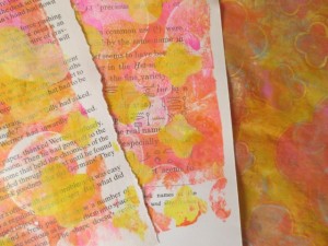
Firstly I used these colors to make a few pages
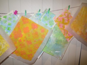
Then changed colors and created a range of prints with different patterns and color mixes. I created quite a few so I would have a range of prints to choose from when I completed the canvases.
Finishing off the Mixed Media Canvas
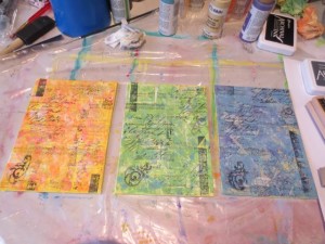
I lined up the three panels and added some stamping with grey Archival Ink
Then I decided to focus on one canvas at at time, starting with the orange and pink one.
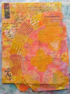
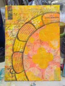
I had created a few sketches in my art journal and transferred these images onto the printed papers to collage the image onto the canvas. For the brightly coloured canvas I used a bright flower, as well as clouds and a feather.
The flower was highlighted with water coloured pencils in black and white
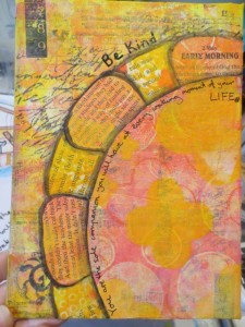
A quote was added with the black Sakura Pigmento Micro 02 marker and Montana Extra Fine Acrylic marker filled with black Golden High Flow Acrylic Carbon Black
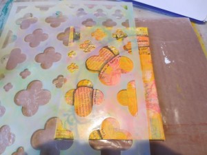
The stencil was used to add more Quatrefoil pattern into the pieces.
Here I used the pink paints with a stencil brush.
Then I highlighted a few of the shapes with charcoal pencil, smudged it a little and added highlights with white pen and marker, as well as adding more shading around the flower
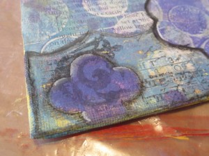
I repeated these steps with the other two canvases. Here is a close up of the highlighted quatrefoil.
When all three were complete, I signed them and gave them a coat of spray gloss varnish to seal the charcoal and give them a nice, glossy finish.
Final mixed media canvas panels
Here are the finished canvas panels
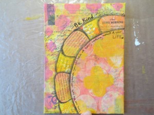
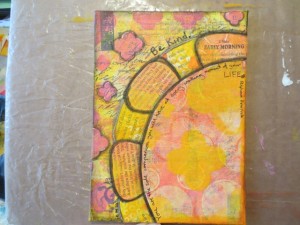
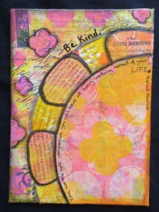
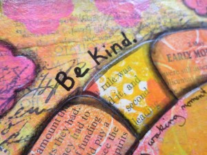
Be Kind: Vivid Orange, Parisian Pink, Moon Yellow and Ivory White
The quote reads “ You are the sole companion you will have at every waking moment of your life”
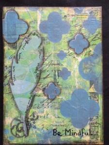
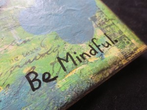
Be Mindful: Lime Green, Deep Ocean Blue and Ivory White
With the quote “You are more powerful than your thoughts.”
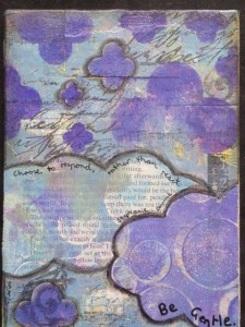
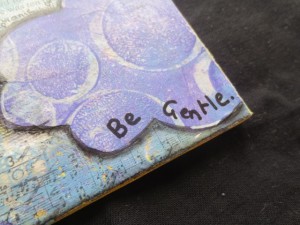
Be Gentle: Deep Ocean Blue, Perfect Purple and Toasted Vanilla
Quote: “Choose to respond, rather than react”
All of the quotes are by Stephanie Dowrick and her book Choosing Happiness
Gelli Printed Papers Giveaway
Michelle has a HEAP of Gelli printed ephemera left over from this project and wants to give YOU a chance to put them to good use and create your own mixed media collage. We are giving away THREE EPHEMERA kits, one in each of the three color combinations.
The winners have been announced ~ See the Announcement “And the Winners are…”
~*~*~*~*~*~*~*~*~*~*~*~*~*~*~*~*~*~*~*~*~*~*~*~*~
Michelle G. Brown is passionate about mixed media art and enjoys sharing her knowledge and techniques with you to allow you to express your own creativity. Michelle understands that many of us have an inner need to create. By learning a few basic techniques the amazing world of mixed media art is accessible to everyone!
Michelle lives with her husband and two boys in Melbourne, Australia.
~*~*~*~*~*~*~*~*~*~*~*~*~*~*~*~*~*~*~*~*~*~*~*~*~
Disclosure: These paints and Mod Podge were provided by Plaid for the purpose of review. All opinions are that of the MixedMediaArt team. The links on this page may include affiliate links and any purchases help to support the ongoing work by MixedMediaArt.
.
.


Wow I love them all so much, these look so great But if I had to choose I might go with the yellow- pink – orange and I would definitely use it in my Mixed Media art Journal
ooh, how pretty. I have been always wanting to try a gelli plate. I hope I win. My favorite color combo is the yellow/pink/orange. I have been enjoying sunflower images and the yellow/pink/orange would help to make those pages for my traveling journal.
Yellow pink and orange is my first choice but I wouldn’t complain about winning any of them!
I do like them all, but if I had to choose, I would pick the purple one. I’d like to try making a similar canvas.
Wonderful techniques and step by step instructions. Would love to experiment with these materials. Thanks for sharing.
I would love to have the Purpley-Blues to make a mixed media piece for my step-daughter. She LOVES purple.
They are all so pretty an unique. I love the purples-blue. I need to save this and try it my self so inspirational.
I love the geeny-blue. I am a beginner working with mixed media. I would love to use the paper on an idea I have for a canvas with some houses to express the heart of a family. I was also just checking out geli plates. I’m thinking of Getting one. I would like to see the papers made with the geli plate.
The Greeny~Blue would be use to make a wedding journal for my son and his bride.This is new to me, so learning will be great! <3
Looks like you had so much fun!! I don’t have a gelli yet. Will some day:) I love them all!! Purpley-Blues! Fairies, flowers and fun. Thanks for the opportunity to win!
These are so beautifull, I really want to get a gelli plate so I can try making some of these beautiful pieces of art!
I love all all the colors, but I think the purple set. I hope I can try your technique sometime in the future! Thanks !
SUCH a tough choice… I think the purple/blues… I would either keep it for inspiration or pay it forward and gift it to someone dear.
Great directions!
Wow! I absolutely love your papers! My favorite is the pink, yellow, orange. I am beginning to art journal and would love to have these for it!
My favorite combination of colors is the purpley-blues. But all of your pages turned out beautiful. Thanks for sharing your techniques.
Oooh love them all, but the purple- blue combo is my favorite. Thanks for sharing your techniques!
I really love yellow- blue- green, in any hue. Its like the sun, sky and mountains, makes me relax.
Ooooh have never tried these! I like the yellow/orange/pink combo!!! I think I would collage like crazy! Maybe some heavy gel medium too? Tissue paper! Thank you for the opportunity! Looks like fun!
I like the purple color combination! I would use them in my collage projects and art journal!
pink and yellow make me really happy so bright so RIGHT
Such lovely work and products. Pick me!
I like the yellow/pink/orange – I;d use them in my journalling!
I love the blues/green!! I am currently creating collages while doing a Kelly Rae Roberts workshop and have LOVE new papers and supplies!! I wod use these in some of my beautiful layers !!
Oh, they’re all so pretty, but I think I like the blue/green combo the best!
Hi Michelle, love seeing that StencilGirl Products stencil on there.
Terrific tutorial.
Wow Michelle! You are really doing a fantastic job exploring new color combos! These look great and fun to play with. There’s something about each one I like- the blue and green color combo really keeps my attention! I’d use them as borders for my art journal and punch them out into shapes using a decorative hole puncher. Thanks for the inspiring review and tutorial GREAT JOB!
These are really pretty. I love the gelli plate for create so many different combinations. Love the blue/green combo
I really appreciate you getting out of your comfort zone and trying new color combinations, for that very reason, I like the orange and pink combo. I think I am ready to use gelli prints in a journal
I really love the greeny-blues and the purpley-blues, and here is why…my daughter and I are both working on Art Journals and we are each doing everything in the are journal in our favorite colors. Mine are the green-blue colors, and my daughter loves the purple colors. WE both come up with page ideas and interpret in our own artistic way. I could really use these Gelli printed papers in my journal!
Purple has been my favorite color for years
I have been in a rehab center since May 4th recovering from a serious fall which required surgery and I’ve been learning to walk again. I take daily pictures at my window while seated in my wheelchair of the changing cloud formations. I have also been writing inspirational poetry as a form if meditation
I would use these papers as a background for the cloud photos with my poetry written around the imagery
I will be discharged home on Friday to continue outpatient therapies and this would be a wonderful art project Sherry Mestel
guess I’m different…I like the blue green best and would make a larger canvas from the. Thanks for the opportunity to use them.
ahhhh, I’m a sunshine girl so the yellow-pink-orange combo is my choice…tho the blue is quite a cool change. I would love to have someone elses hand in my art. sometimes I use the same combos and when I teach I am thrilled to see some new ideas at work! I do lots of mixed media canvas’ as well as altered books.
I love the purpley-blues, I will try this combo as I don’t use enough blues in my paintings
Purple/Blues would be my favorite. Love the canvas the are all wonderful and love that you used affordable products. I would probably do the same thing make canvases with the sheets, or use it in my art journal, or tear them apart and add them as decoupage to some altered box, saving the scraps for ATC’s or Inchies or whatever .. Thanks for sharing or for the chance to win..
I actually love all of the color combinations! But if I had to narrow it down I would pick Purpley – Blues. I would use the papers as background sheets for my scrapbooks. I love your ideas and stencils, So cool! You guys are so creative! Thanks for sharing your creative processes!
Wow! Great technique when you have limited canvases/paint. Love all three color combos but my favorite is the greeny-blue set. My craft room is done is the same green and blue colors so I would make a mixed media painting using those gelli prints to hang for inspiration in my art space. Thanks for sharing!
Love the purpley-blues. they are such calming colors together. I would use them for back grounds on cards, and in a couple of mixed media projects I am working on. I have just started my art journal, and would love to have this as one of my featured pages
Love them all Michelle!! But I love Green-Blues the most!!! I would use them in my collages and mixed media art. I LOVE putting other artist’s thumbprint in my own work!!!
I like to do paper art, like a relief and would use all 3 to construct a nature scene. The Purpley-Blue is my favorite. I would use it to cut feathers and construct a bird. The greeney-blue I would use to cut into leaves, trees and bushes. The last color combo I would use to make flowers, the sun and perhaps a house and/or a walk way.
I love the pinks and purple colours but they are all lovely I have been looking at buying a gellie plate for a while but not quite sure about it need to do some more home work on them thanks for a chance to win
I just love the yellow-orange-pink combo. I like using these colors in my planner.
I like all of the colors! I love purples and blues but I would choose the greeny-blues first because I’d love to do a nature panel with trees and blue flowers…..Mother Nature wins out with me!!! I love nature!!!
I like the purplely-blues. I would use some of them to cut down for ATCs for my club and I would definitely use one of them to create my own canvas. I just got a gelli plate for my birthday and can’t wait to use it.
Michelle your work is awesome! As usual you knocked it out of the ballpark. If I were to win I would do a canvas and mixed media greeting cards which look really awesome. If any were left after these projects I would love to make an atc journal book. Thank you for the chance to win this awesome giveaway!
I think I like the blue-green best, although I love all three! I have no experience with gelli plates and love love to see the results of using them. I am doing lots of collage and would use the papers in some upcoming pieces.
I live by the ocean and love to watch the ever changing patterns of clouds and sun, light and dark, warmth and shadows reflecting off the great expanse of sea. In the midst of winter my muse, the ocean, isn’t quite as inspirational or as calming. The warmth and the patterns it reflects are muted by the chill winds and dark skies. Thus my fave gelli printed papers would have to be the blue/green hues. On the most bitter of days they would serve to remind me of the joy of being my the sea, the pleasure it brings me and also that even after the most darkest of times comes light, warmth and hope. The blue/green papers would be like bringing the sun inside!
Elizabeth – you NEED a Gelli Plate! If you need help getting one in Australia, just let me (Michelle) know!
I love the pink orange and yellow combo. I too struggle with color and think you did an excellent job. I’d incorporate into my art journal as a visual reminder to not be afraid to experiment.
My favourite pages are the purple ones which would look pretty cool in one of my fabric and paper lace books.
Thanks for the opportunity.
Suzy
I am a purpley gal lol lol – thanks for the opportunity to be able to use some of your awesome paper in my art journals
And thanks for your generous sharing of your creative step by step process – much appreciated
I love the greenly-blue. Reminds me of the ocean/beach. Would use them for a mixed media book on travel with a beach theme. Thanks
TFS the techniques and the clear step by step instructions, it’s inspiring. I’d use the Greeny-blue pieces for sea themed cards’ backgrounds and for art journaling. Thank you!
Dorly Weitzen
I like to art journal pages, I go so far then I have to wait for things to dry, then bugger me dead I forget what I want to do so I do something else on the page and the contuniaty is not there. That’s what I lack,so if some were pre done for me I MAY have better luck…..by the way yours looks great
Colleen
Australia
They are all lovely but if I had to choose, I like Yellowy Orange. Thank’s for the chance to win.
Greeny-blue for me, please. I would expand on one of the pages in my nature book, creating a larger mixed-media piece on canvas board. Thank you for the step-by-step tutorial.
I love what you did with the canvases and thanks for sharing step by step; I like all the colour ways you’ve used but I do always seem to be drawn towards purples and blues. The current way I’m using my gelli prints(as well as for ATC and card backgrounds) is to make hanging bird mobiles – each side can be different and you can do different sizes to use up those scraps, or where only part of the print has a pattern you like. Layer up buttons for eyes and do a bit of doodling in white pen and they look great.
Thanks for the chance to win some of your gorgeous prints.
Lyn
England
Ooh – such loveliness :o) I usually work with greens and blues and can be afraid of brighter colourways so I would love the yellow – orange -pinks as it would challenge me and as they would be a gift I would have to use them!
Such beautiful color combinations! From the 3, I would choose the yellow, pink colors, because I am very drawn to sunshiny colors, and they make me so happy! I would use the paper for a backdrop on some flowers colored pencil/ink drawings I’m working on, some poetry I’m working on writing and illustrating, and cheery greeting cards for some dear friends!
I would love the purple blue or any of them really. Haven’t done any gelli plates…yet! Love how they turned out.
Thanks,
Sari
Texas
One Christmas I cut horse shapes out of pretty background paper and decorated my whole tree in beautiful horses with ribbon reins. I would definitely like to make my own paper to make the dancing horse mobiles. As for the beautiful canvases you have done, I am definitely while surprising, since I am such a turquoise person, choose the purple combination. What a lovely gift to make supporting paintings on this collection. Thank you for sharing.
I like all the different color combinations that you came up with. If I were to win a set I would probably put it with my other gelli pages I have made and turn those pages into a handmade journal.
Love the purplely blues. Purple is my favorite color. But all three combos are lovely!
I love the purpley blues. My first instinct is to use them in my DLP journal, but I might also incorporate into a larger Zentangle inspired piece. Great tutorial and lovely color combinations.
Love your work. I really love the green and blue combo. I would use your papers in a journal and some mixed media panels. Maybe even in some of my paper mache’ creations.
I would love to win the blues!
Since blue is my favorite color, I love the Purpley-Blues combination. I have some canvases just laying on the shelf that these would look gorgeous on and an idea floating around in my head with birds and cages and vines and flowers… well, you get the idea. I love what you did with the prints.
I like the yellow one – such a happy color for summer! I would use it to create a journal page celebrating the beautiful flowers in bloom on my back deck.
Oooh, all so pretty-but hands down, may favorite is the purple one. That’s because my granddaughter’s bedroom is purple . . . and I would make something fun with her for her room..
Luv this, I’m goin to try it, thanks for the inspiration:) xo
bluey purples! I would begin a memory book of my life with my hubby. those are our favourite colours
When you are a lover of colour it is hard to choose just one. Greeny-blue would have to be my choice. Oddly enough I just spent a year in a Developong Bahavioural Therapy course for my depression and anxiety and one of the things we were taught was how to be `mindful`.
Years ago I was a decorative painter, we did not have internet at the time so taught myslef through books and the very few programs on TV. The first paints I had ever used were Folk Art. Now years later, trying to find my way again and turning to art therapy, I continue to use Folk Art paints. Have not tried Gelli Plate as it is not in the budget at the current time.
Through Mixed Media Art and now the internet, I am grateful to all who share free of charge. For people like me, I cannot thank all for being part of my healing process. Thank you
What can I say only that I love everything you demo …plus seeing these beautiful colored papers makes me drool. If I could play with these lovely papers I’d select the yellow/pink/orange and purple/blues. They would make great clothes for drawn and painted dolls or butterflies etc. The list is unending. Backgrounds for many subjects or used as 3-D objects. Thanks for the chance to win. Happy dog days of summer 2014.
I’d challenge myself by choosing the YELLOW-PINK-ORANGE!
Colours outside my comfort zone!
What would I do? A mixed media collage using an assortment of papers, fabric, yarns, fibres and threads that tone in – all from my stash!
Techniques? the sky is the limit! I’d definitely include stitch!!!
I can’t wait to give it a try!
I love all of them. If I had to pick, probably the purples, blues. I need to play with my gelli plate. Everytime I buy canavas, my granddaughters get them and paint them. They are 10 and 7, so I have alot of originals. The 10 yo just started painting over what she does not like
I really like the green/blue combination. I would use them for a series of canvases I have just started working on.
I love how you show everything start to finish…and I love the finished product! Thanks for the inspiration!
I love it all but the green blue is my favourite
I would definitly choose the purpley-blues, as my 10 year old Grand-daughter is working on her very first “real” art journal and she LOVES these colors! Thanks for the opportunity– I love this site, so much info and fun stuff.
I love the pink-orange-yellow combo because it is Wed. and I am feeling optomistic…so I feel sunny and therefore I like the sunny combo. Loved the article…thx.
I love the yellow-pink-orange combo!!! I would use them to make Artist Trading Cards to trade with others!!!