Composition for Mixed Media Art

~ * ~

This article is written by Marilyn Harris Mills

Here is the third installment in Marilyn’s Good Design and Composition. You can read the first installment here: Good Design and Composition for Mixed Media Art, which covers the elements of a good design. You can read the second installment here:  6 Principles for Composition in Mixed Media Art and here we cover six principles of design.

Finally we look at a few principles of design that I threw into the mix myself: Emotions, Confidence and Remembrance.

Emotions/Moods

So many times I’ll view artwork and think to myself…well gee, I could have come up with that idea! What is it about a certain piece that evokes an emotion within us…or creates a type of mood we feel? Peacefulness, tranquility, craziness, loveliness, loneliness, encouragement? Design elements need to contribute to creating a mood or an emotion within the viewer. To do this successfully the elements all need to work together to evoke a certain mood or emotion the artist wishes to convey to the viewer. Think of this principle when viewing art. What do you feel? What is the artist trying to get you to feel?

i.e. Valentine’s Day…love is the mood when you’re creating a greeting card for someone special.

Confidence

Does your artwork speak confidently to the viewer? Are you certain of what you were trying to convey when you were creating? Did you feel wishy-washy with your approach to your painting? Were you confident with the techniques you employed? If you’re not confident while painting, this relational aspect will be noticed and felt by the viewer. Make sure you know the reason behind choosing the subject matter that you used. Make sure you paint with confidence, it will show in your final art piece and the viewer will be appreciative of your artistic art message.

Remembrance

Have you ever looked at a photograph and it was so striking to you that you remembered it days later? This would be considered a good piece of art. The photographer has captured his subject well. So too should your art piece….be remembered. Creating an art piece that will be remembered is hard to accomplish….we’re not Da Vinci. We have to “work” at our art, research, learn new techniques so that we can create our own style.

A style that will be captured in each of your paintings so that your art will be remembered. Think of visitors to your home…they will remember the way you decorated if you’ve chosen to emphasize a certain theme using a particular colour palette with complementary drapery, accessories etc. Be different than other artists. Create in your own unique style…then both you and your artwork will be remembered.

A successful art work will encompass all of these elements and principles of design. Don’t expect to get it right the first time. Trial and error. I have more canvases sitting in the “oh…that didn’t work” bin than I do canvases that did work. I have kept every yucky canvas…it helps me to remember what I did wrong and what I still need to learn. Any art journey is all about learning, creating, adjusting and first and foremost applying the principles of design.

Some artists tend to paint on a flat surface whereas other artists may paint on a variety of three dimensional surfaces. No matter the surface, composition refers to the overall arrangement of all the parts of the design, the six elements. How do we put these various elements together to create a good composition within the painting?

Composition

Now, let’s talk about composition briefly here. Composition refers to the arrangement of all the elements of a design. You can arrange the pieces in a few different ways. First though, you must choose a focal point….a point of interest or what I like to refer to as the “meat” of the painting….what is the most important part? Oh and the centre of interest is not in the centre of the painting….its slightly off-centre.

To help create a centre of interest, artists use The Golden Mean, a mathematical formula used by the Greeks and Romans to determine the most pleasing aesthetic proportions. To find the Golden Mean, divide your substrate into thirds vertically and again horizontally to make nine equal parts. The four center points at which the lines intersect are considered the best locations to place the focal point of your painting thus ensuring a successful composition. I encourage you to search the internet to learn more about the Golden Mean.

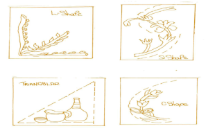
Here’s a few classic layouts for good composition dependent on your subject

elements of good composition

So that’s about it….the elements and principles of good design and composition. Learn all this first and then you can go about breaking the rules!!!

Stay ARTistically Inspired…

Maer

Read Part One: Good Design & Composition for Mixed Media Art

Read Part Two: Six Principles for Composition in Mixed Media Art

~*~*~*~*~*~*~*~*~*~*~*~*~*~*~*~*~*~*~*~*~*~*~*~*~

Marilyn Harris Mills, aka Maer, is a Published Artist, Teacher and Designer, in Ottawa Canada.

You can read about Marilyn at Maer’s Muses. Her art has been published in “Creating Time: Using Creativity to Reinvent the Clock and Reclaim Your Life”

“I work in whatever medium likes me at the moment”-Mark Chagall

~*~*~*~*~*~*~*~*~*~*~*~*~*~*~*~*~*~*~*~*~*~*~*~*~
6 Principles for Composition in Mixed Media Art

~ * ~

This article is written by Marilyn Harris Mills

Here is the second installment in Marilyn’s Good Design and Composition. You can read the first installment here: Good Design and Composition for Mixed Media Art, which covers the elements of a good design. Now let’s look at the principles of design….principles that should apply to each piece of art work we create. This is the “how-to” for achieving good design.

6 Principles for Good Design and Composition

1) Proportion

Consider all the individual design elements in your painting. Are they all proportional or are some too dominant and others to small. Think of a flower. Are the leaves larger than the petals consequently the flower looks abnormal? Perhaps this would work in an abstract painting but if you’re aiming for a still life or a realistic style then the painting would not be proportional. Proportion and scale is all about size relationships. Proportion deals with the size of the parts that make up the whole. Sometimes artists will change proportions of different elements in a painting, but it still has to look right in relation to the entire composition for the painting to work.

2) Unity/Variety

A principle where all the individual components of the painting tie together. This creates a piece of art wherein all the components or elements in the design co-exist with each other and complement each other. Colours, backgrounds, layout, embellishments, brush strokes etc all work together and not one area of the painting is amiss. When a painting has unity, there is a feeling that it all works together as a whole and is complete. Variety is often linked with unity. While you want to have unity, you don’t want it to be boring. Having all shapes the same size would provide unity but it would not have much variety. Change the size or change the shapes. Variety can be achieved with colour, size, texture and edges. When a painting has both unity and variety, it is said to have harmony. Harmony within the painting is to be strived for.

i.e. a Chinese art piece….motifs, colour, symbols that are Chinese in style will not work together if a Canadian maple leaf is added to the art.

Mixed Media artwork by Gloria Malouf-Marsh

Artwork by Gloria Malouf-Marsh – A Desert at Sunset

3) Contrast

Contrast makes your painting exciting I think. You can use lights against darks. A stroke of intense colour can make a neutral painting sing. The meaning of contrast are the differences when you compare one thing to another. Differing values in a painting can be dramatic. Diagonal lines against verticals, colours that jangle, lights against darks, soft edges against hard edges, intense colour against neutral colour…..there are a variety of ways to create contrast in your painting.

4) Rhythm/Repetition

Rhythm is created by having an element repeat itself in the painting. Rhythm always has repetition. Repetitions move your eyes through the painting. Rhythm can be regularly repeated, like lines, shapes, colour etcetera, or repetitions that alternate, for example from large to small, warm to cool et cetera. Repeating shapes can lead the eye through a painting and give it rhythm. Sometimes the rhythm can be lyrical for example just like in music.

5) Balance

Think of a teeter-toter, the balance is in the middle. The design must be balanced for it to work effectively. If the design is balanced then the scale of it is also in balance. So one way of thinking of balance is large elements combined with small elements in the picture will provide a balanced painting. If you have only used large elements then the entire painting is off balance. Balance is key to a successful painting. When something is balanced it looks right. You can use colour to achieve balance. You can use a large shape balanced with several small shapes. I tend to think balance is ingrained in ourselves but others may need to work at maintaining balance.

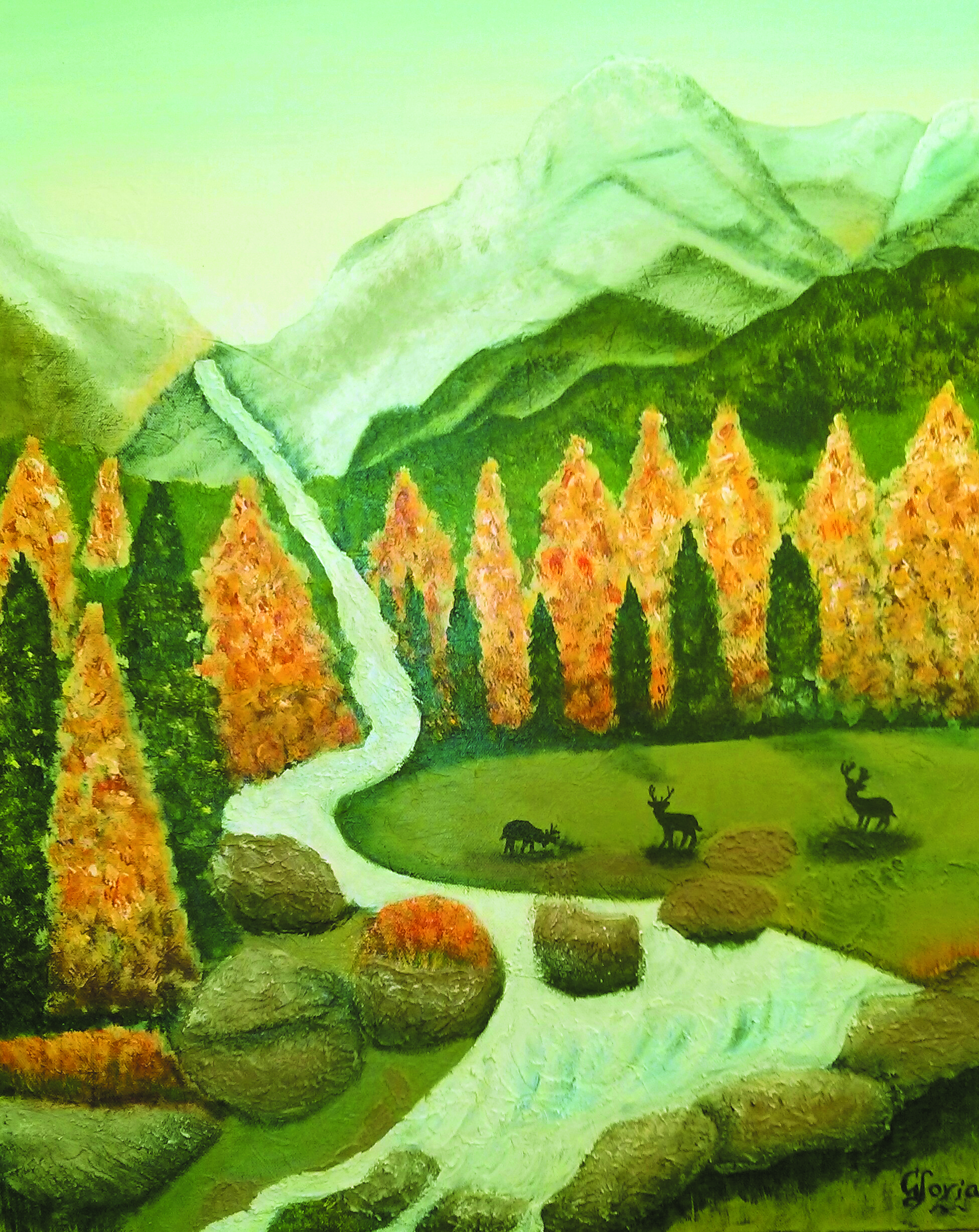
Mixed Media artwork by Gloria Malouf-Marsh

Artwork by Gloria Malouf-Marsh – Late Afternoon at Elk Meadows

6) Focus/Emphasis

Does your art piece establish a focal point or does the viewer travel all over the project trying to find a landing place for the eye to rest. If there is no focal point, then the viewer will get confused, feel disturbed and otherwise will miss the message the artist is trying to elicit. Every painting needs a centre of interest and without one, the painting is rendered without much thought by the artist and deemed unappreciated by the viewer. There are many ways to create a focal point. Lines can point you there. Value contrast (lights and darks), size, and even content are all ways to helping create a focus in the painting. Having a theme or story to your painting gives your painting emphasis. That’s why I like using symbols and imagery in my mixed media art. They tell a story for me.

Stay ARTistically Inspired…

Maer

Read Part One: Good Design & Composition for Mixed Media Art

Read Part Three: Further Composition for Mixed Media Art

~*~*~*~*~*~*~*~*~*~*~*~*~*~*~*~*~*~*~*~*~*~*~*~*~

Marilyn Harris Mills, aka Maer, is a Published Artist, Teacher and Designer, in Ottawa Canada. Her art has been published in “Creating Time: Using Creativity to Reinvent the Clock and Reclaim Your Life”

“I work in whatever medium likes me at the moment”-Mark Chagall

~*~*~*~*~*~*~*~*~*~*~*~*~*~*~*~*~*~*~*~*~*~*~*~*~

.

.

Good Design and Composition for Mixed Media Art

~ * ~

This article is written by Marilyn Harris Mills

What is considered good design and good composition?

A greatly debated subject for sure….some consider design to be innovative, cutting edge while others consider good design to evoke emotion with a concentrated colour palette. Who really knows what good design is? Perhaps a subjective matter.

Good Design and Composition for Mixed Media Art

However we judge a good art piece, there are some elements and principles which define a good painting. Whether we design from using our imagination or design from a photograph of our own, some key factors should be considered and applied. You have to teach yourself the basic rules, apply them and then once you’re very knowledgeable then you may go ahead and become creative developing your own style.

The elements of design are the visual elements or tools you use to compose and design. The principles tell you how to use and combine these elements. They help you to organize your composition.

Elements of Good Composition

Let’s first look at the elements of a good composition. These elements should be applied for each painting, whether we are using watercolours, pencils, charcoal or mixed media. Without these elements, our painting is rendered something other than a work of art.

1) Line

Using the correct line within a painting sets the tone of the art. Horizontal, vertical and diagonal, straight, curved, thick or thin can be used. Lines move the viewer into, around and out of your painting. They lead the viewer’s eye and direct it to the center of interest. Using curvy lines will create a more relaxed and casual tone….do we want to stand up and shout or sit and be quiet?! Lines will set the tone. ie think dog fur and the type of breed. A short wiry fur similar to a jack russell fur certainly would look funny on an English sheep dog. In this example the fur compliments the dog breed.

2) Shape

Think small, medium or large for variety. Same sized shapes would be boring. Shapes are organic or geometric. Usually both are included in a painting. Organic shapes are curved, irregular and have a natural feel to them. Geometric shapes are triangles, squares, rectangles and circles. You can paint the shapes either positively, by painting the actual shape or negatively, by painting the space around them. Usually both types of shapes are included into a painting with one being more dominant than the other.

3) Space

Shapes fill spaces. A canvas is a shape itself. You fill this space with shapes to create your painting. The shapes or objects are positive space and the space between and around these shapes or objects is negative space. Both are important. Using shape creates depth in a painting by overlapping them or weaving them together, or laying them side by side. Designing a painting is like putting together a puzzle to create an entire painting.

4) Form

When you draw a circle, once you add form and give it dimension the circle becomes a sphere, a square becomes a cube. So too must you give the objects in your painting, form to achieve dimension. In still life paintings, a direct source of light provides shadows and highlights giving it dimension.

5) Colour

Use a colour wheel if you’re first beginning. Learn about what colours go with each other ie red and green or using a yellow with a purple makes the painting pop. Once you’ve acquired a basic understanding, colour theory courses are a must for the serious artist. The thought by many is that colour is the first design element a viewer will notice and/or remember. Colour speaks first in a painting some say. On the other hand, some may disagree, you’ll need to judge for yourself. If your taste is for pastels, then a bright red incorporated into the canvas will set forth a jungle of nerves for you.

Using colour can make or break a design. If the colours used don’t work together, then forget your whole art piece….another one for the yuck bin. When colours are in competition with each other…they tend to scream at you. When the colours do work together, you’re at peace with the painting.

6) Texture

I love creating texture in a painting and often I find this is the easiest element to achieve. Texture can be actual or perceived. Texture refers to the surface appearance of the objects in the painting. Are we wanting to create a smooth velvety surface such as a piece of satin cloth or a rough aged piece of driftwood or even the skin of an elephant? Texture is fun because it creates excitement, interest in your painting…dynamics is the word I like to use to describe texture. However, don’t use too much texture in a painting, you can over do it!

Stay ARTistically Inspired.

Read Part Two: 6 Principles for Composition in Mixed Media Art

Read Part Three: Composition for Mixed Media Art

~*~*~*~*~*~*~*~*~*~*~*~*~*~*~*~*~*~*~*~*~*~*~*~*~
Marilyn Harris Mills, aka Maer, is a Published Artist, Teacher and Designer, in Ottawa Canada.

You can read about Marilyn at Maer’s Muses. Her art has been published in “Creating Time: Using Creativity to Reinvent the Clock and Reclaim Your Life”

“I work in whatever medium likes me at the moment”-Mark Chagall

~*~*~*~*~*~*~*~*~*~*~*~*~*~*~*~*~*~*~*~*~*~*~*~*~